Cheyenne Mountain Zoo
Website Redesign
Timeline: 4 months (2026)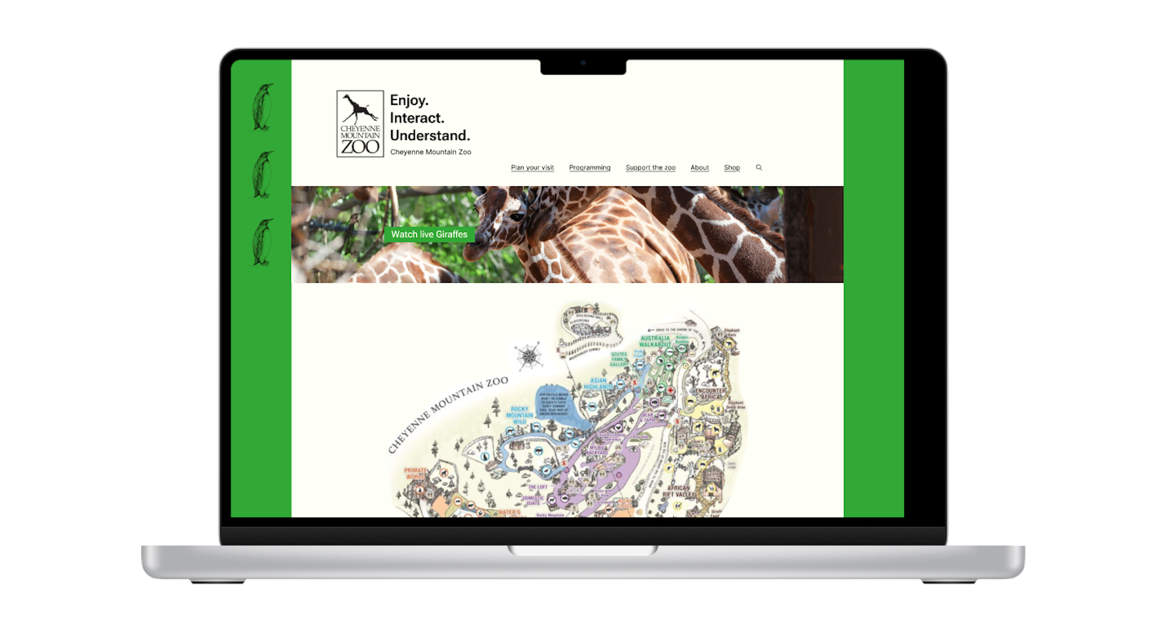
Role:
Art direction, product design, branding, research, data synthesis, prototyping - With a small team I took on these roles to update the user experience design for the CMZ's website and streamlined the ticket flow for purchasing tickets to enter the zoo.
Project Goals:
Redesign the CMZ's ticket purchasing flow to create a streamlined, efficient, and navigable experience for users. Conduct in-person usability tests with 5 people on the CMZ's current site to identify, troubleshoot, and resolve any pain points in the current site design. Throughout this process I also updated the site's aesthetic design principles to match the organization's goal of having a minimalist and visually unique design that stands out in their industry.
Project challenges + limitations:
Reorganize the site while ensuring key content (identified during usability tests) remained a prominent site feature was a fun challenge. Before the redesign users frequently noted that the volume and organization of the site's content hindered their ability to navigate the site easily. Organizing the content for ease of use while ensuring site patrons retained access to all of the zoo's useful resources was a core focus of this redesign. Limitations included finite resource allocations for this project at 8hrs/wk.
Research
Usability testing P1 + How might we?:
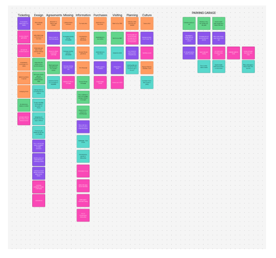
Twice over the course of the design process I conducted 15-25 minutes meetings with 5 individuals to identify pain points within’ the website’s current design. Our initial meetings revealed pain points pertaining to what users felt was an overwhelming amount of information throughout the website, pop-ups that caused users to feel they were being scammed, un-necessary multi-step ticket purchasing windows, and inconsistent design principles. After our initial interviews I organized the research into an affinity map to better understand the data and generated How might we statements to begin the process of finding solutions for current pain points within’ the website design.
How might we?:
These How might we questions were generated after the Usability Testing phase of the design process. They allowed us reframe the insights that were gathered as questions which enabled us to define the problems we needed to solve without defining how we were going to solve them. This was an essential part of the design process as it allowed us to begin working on the website redesign so we could test design changes with our Usability Testing group before fully committing to a design direction. This enabled our design process to be efficient, user centered, and timely.
1. How might we design our site to organize our information more manageably for our guests?
2. How might we increase ease of navigation when asking users to purchase tickets?
3. How might we change the select a date and time process of our purchase to maintain
user interest?
Design: Phase 1
Problem Statement:
Zoo patrons need a streamlined way to purchase tickets for the CMZ because the current design hinders their ability to navigate the site efficiently and securely.
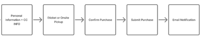
Task Flow:
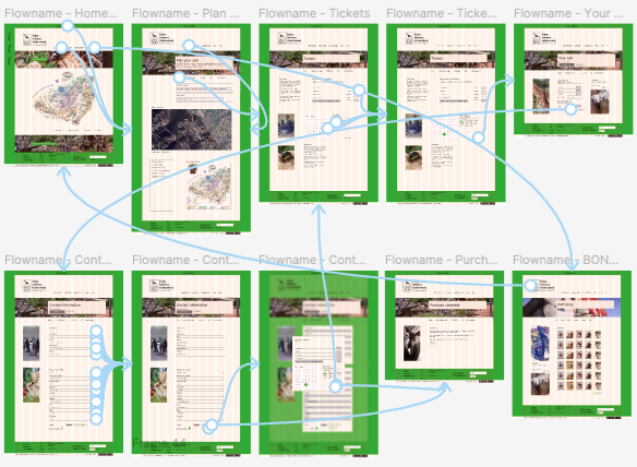
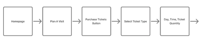
Once I had analyzed and reorganized the data from the Usability Testing phase of the project I created a task flow in order begin the process of visualizing what design changes needed to be made. My goal was to increase ease of use for patrons by reducing the number of pages between the Homepage and the Order confirmation page. I did this to save them time and reduce confusion on the site.
Design: Phase 2
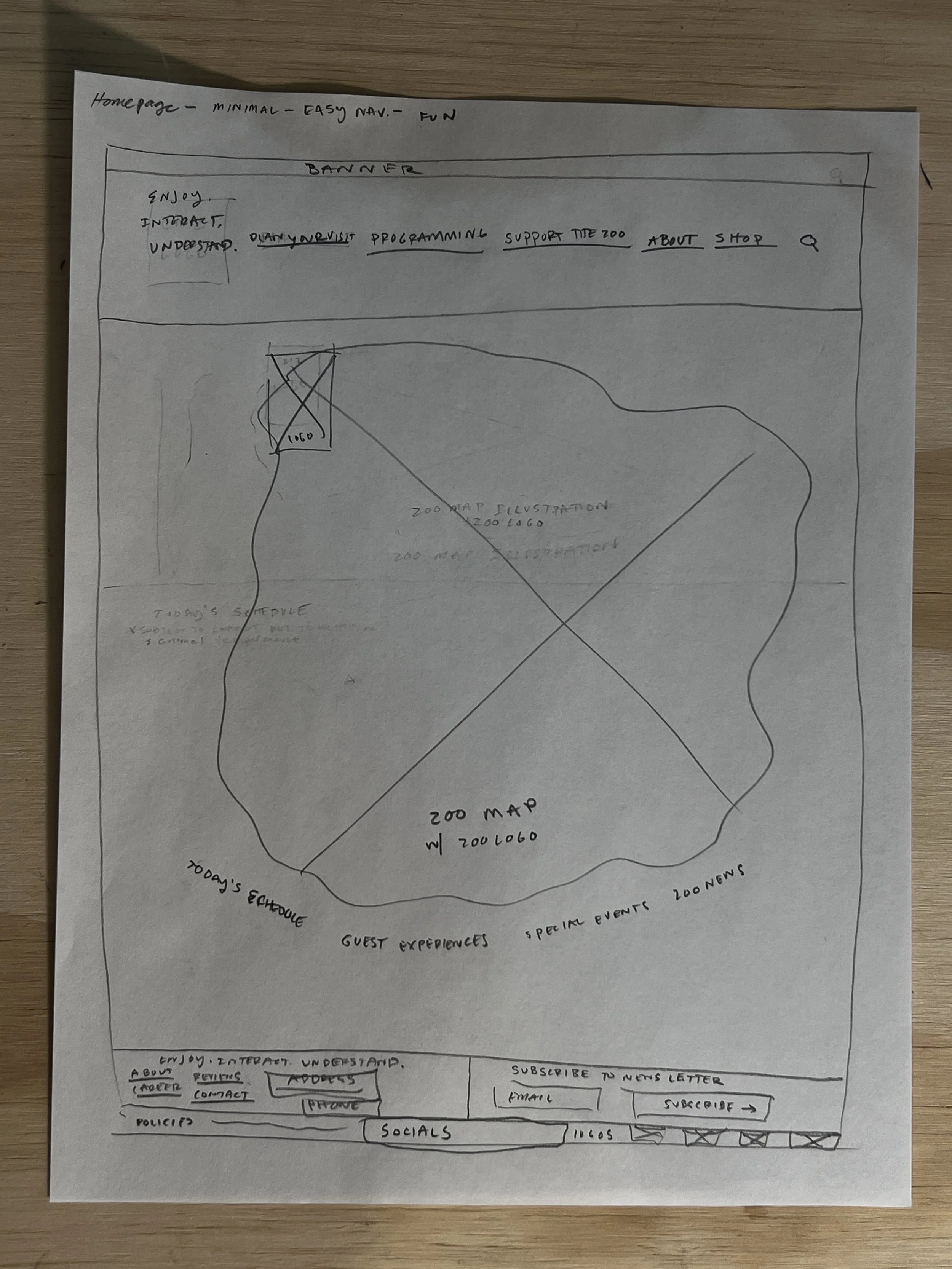
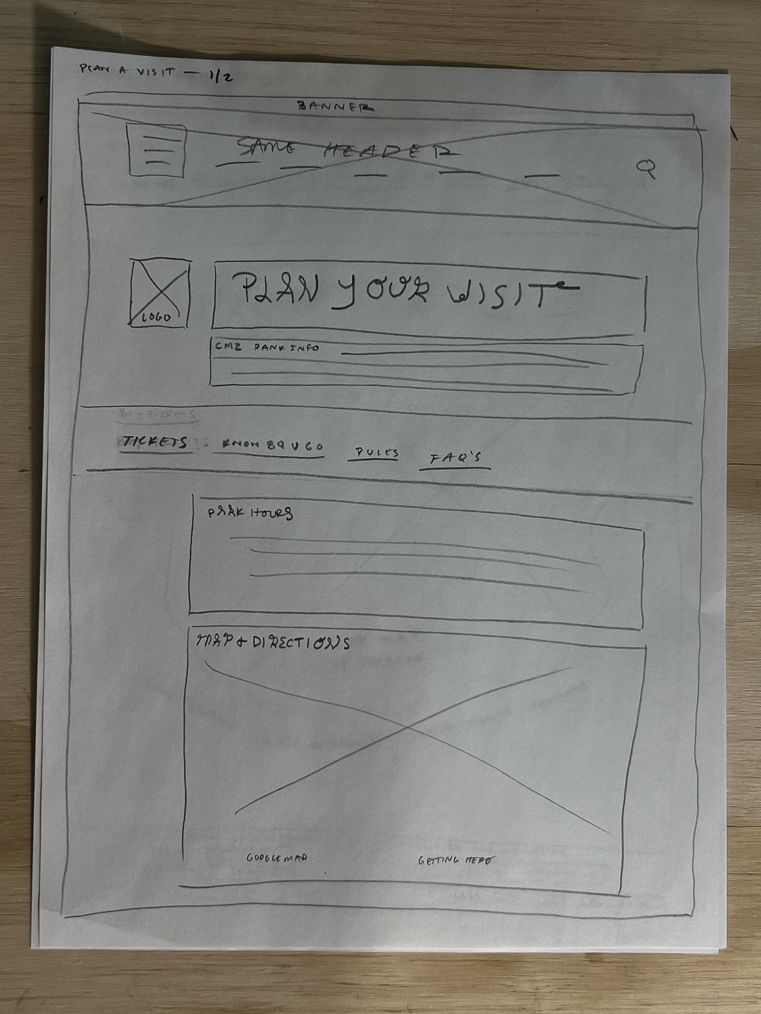
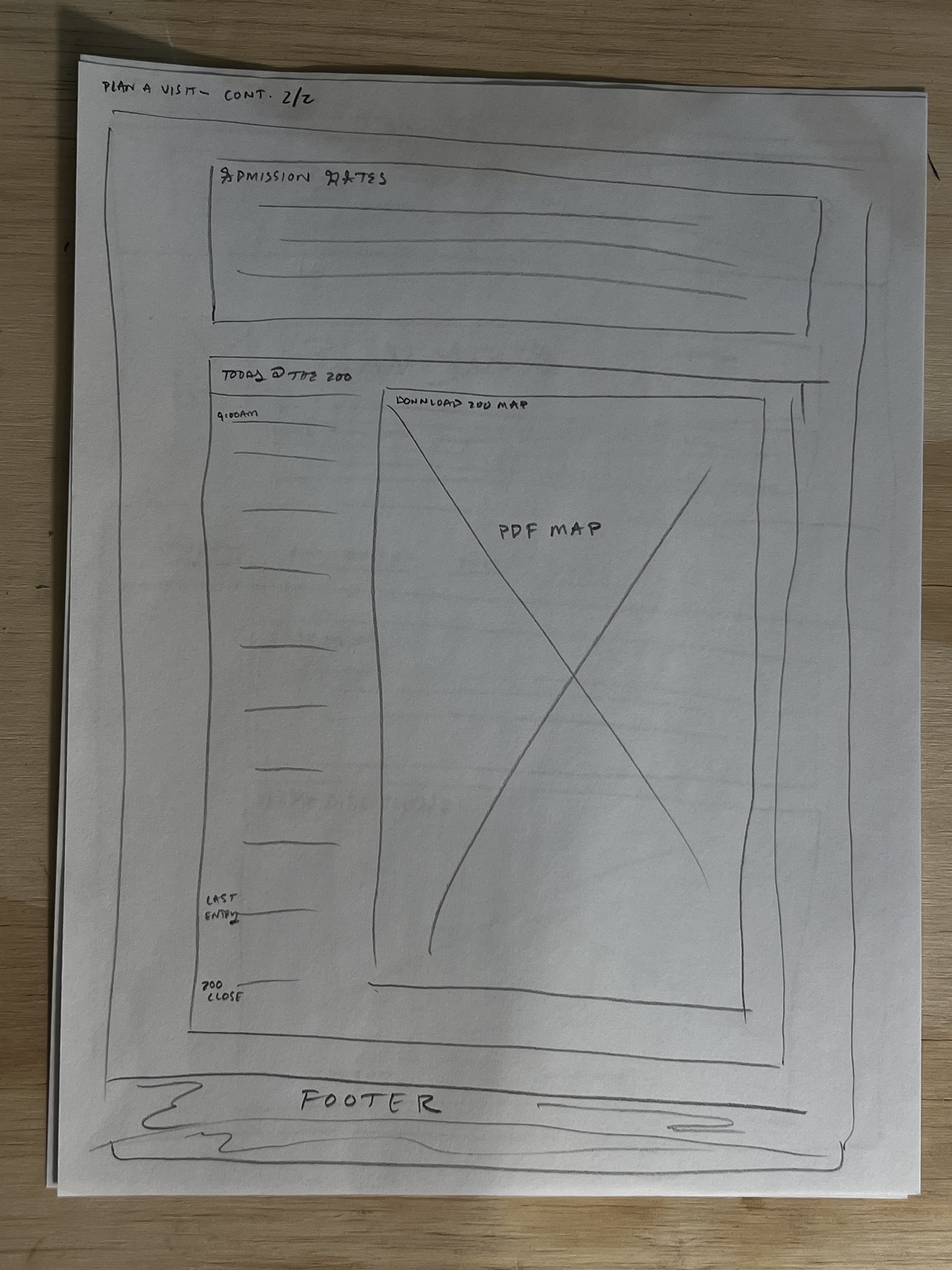
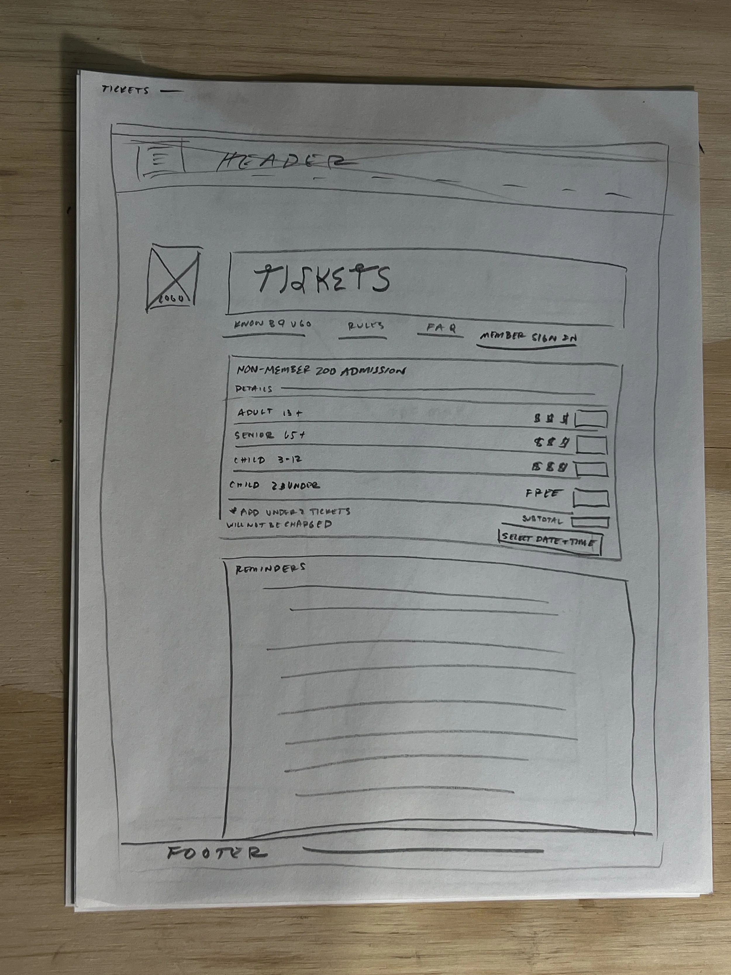
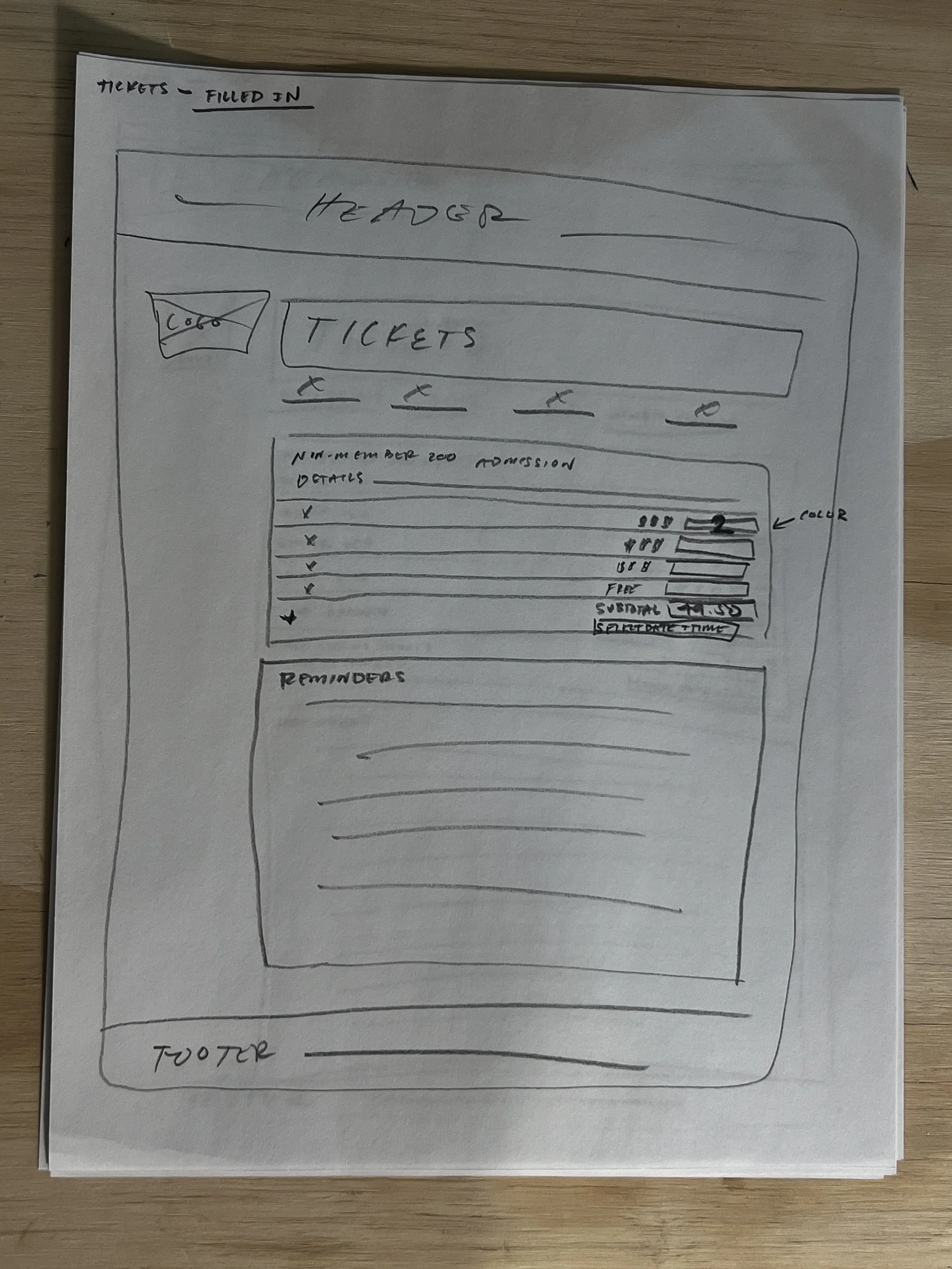
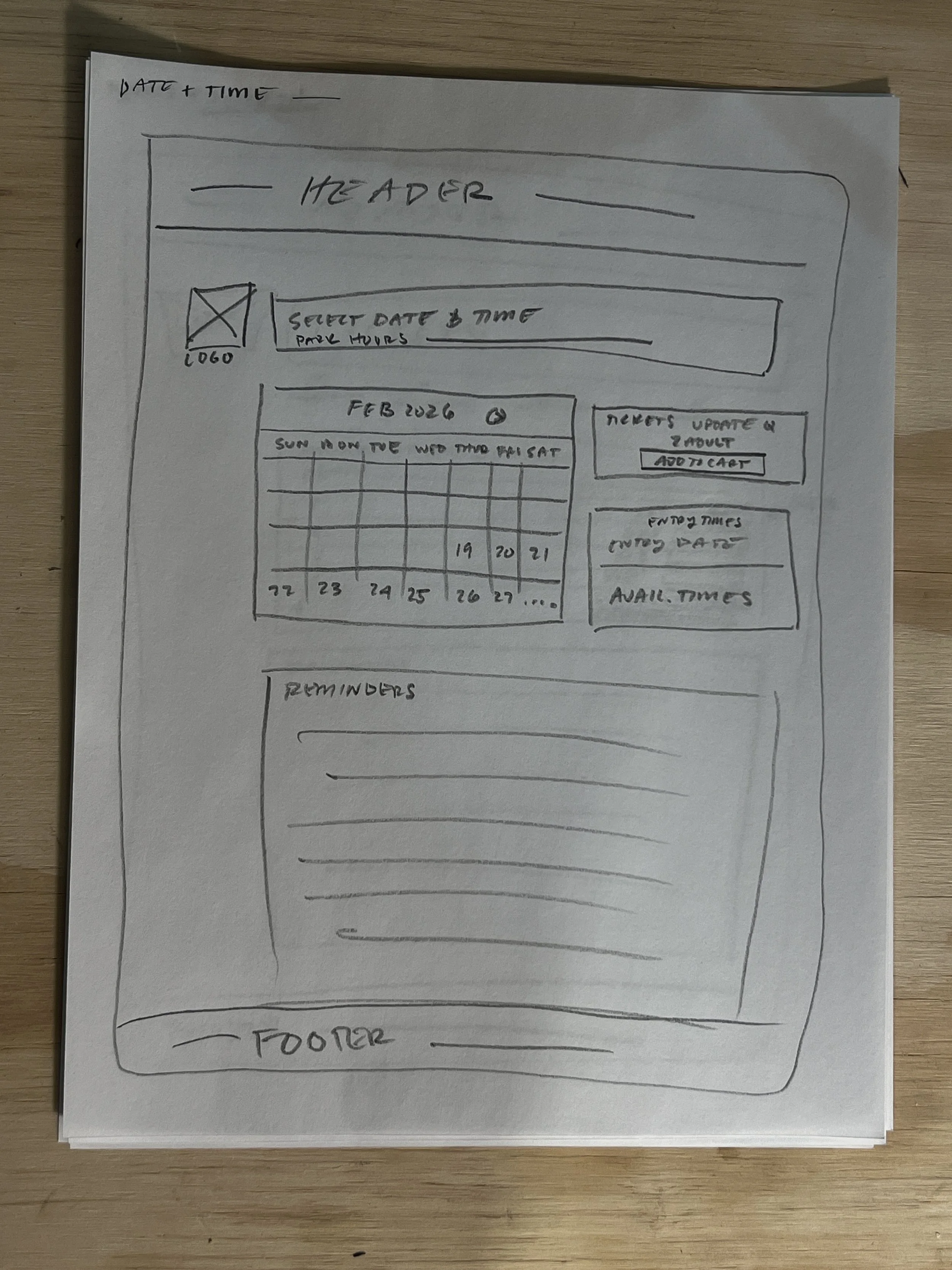
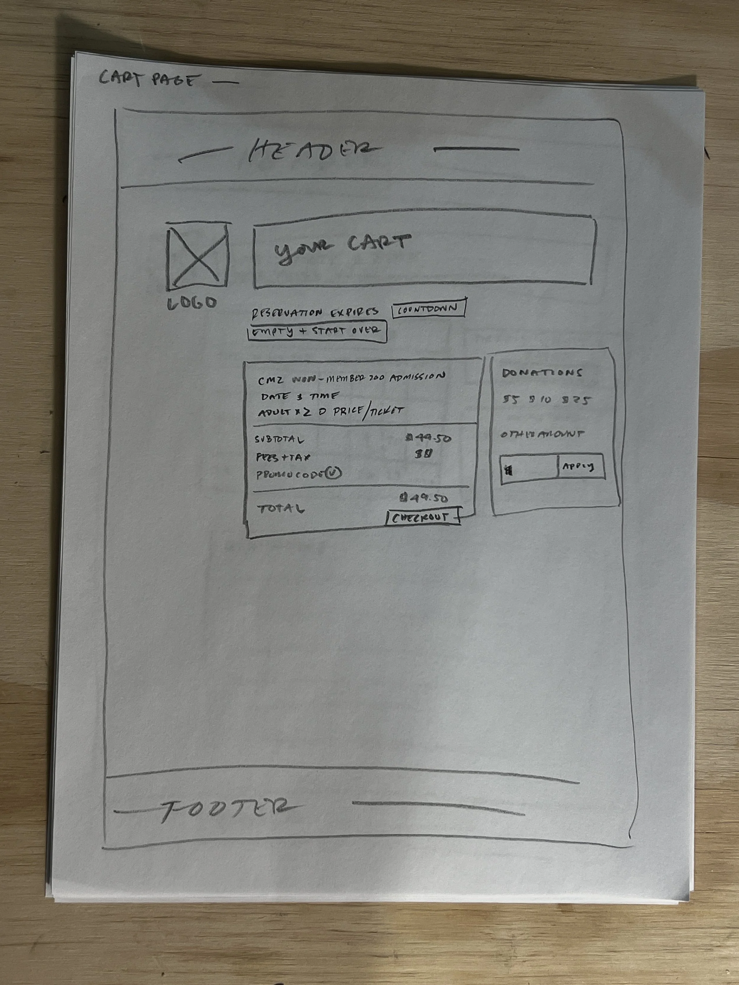
Low Fidelity:
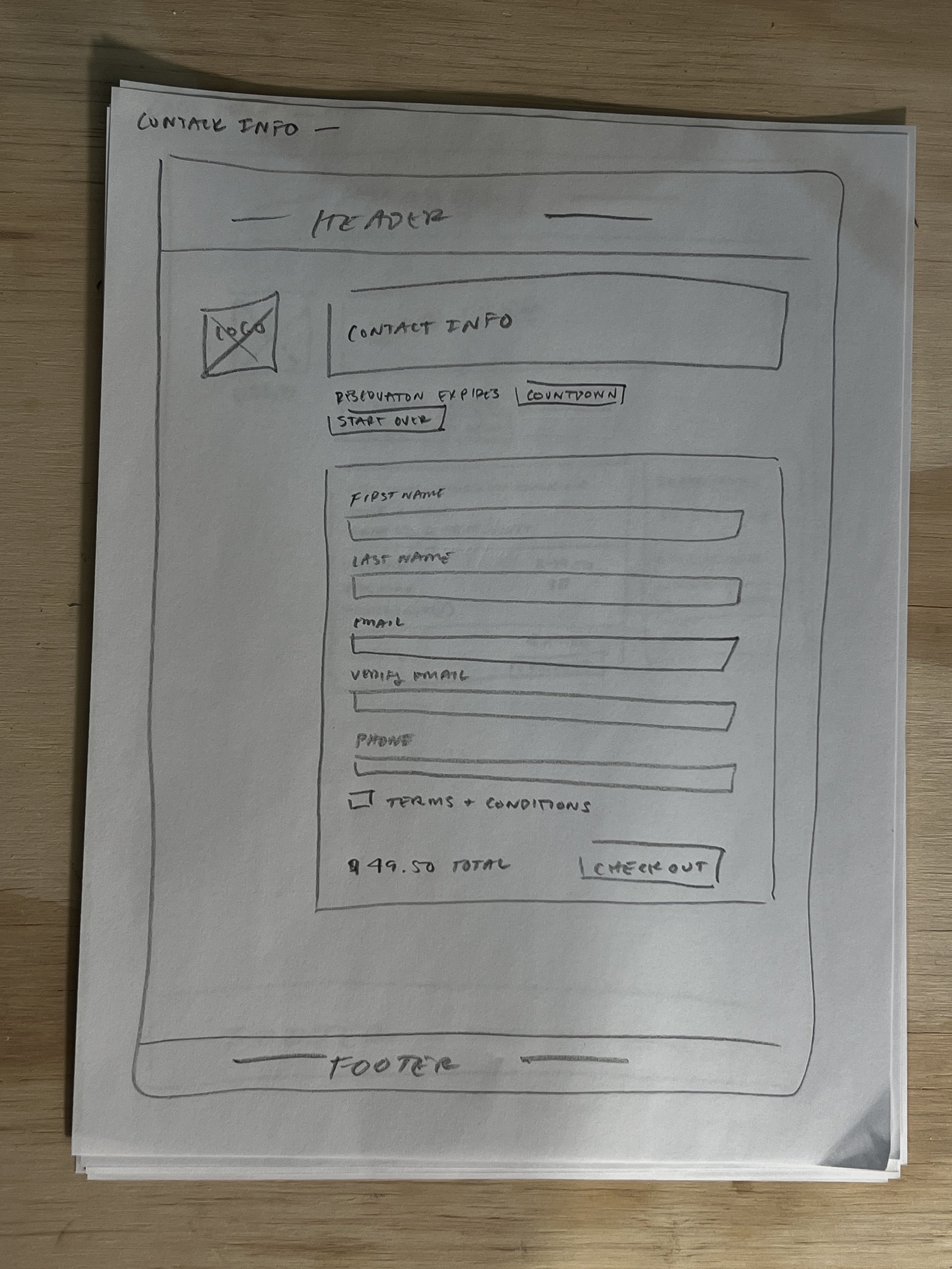
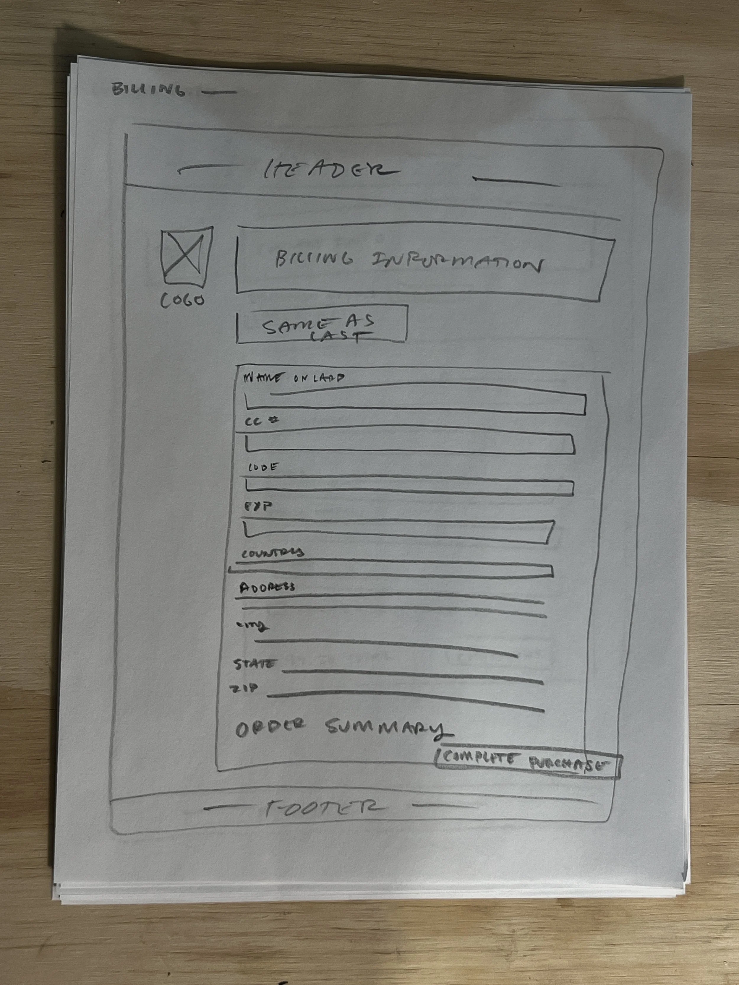
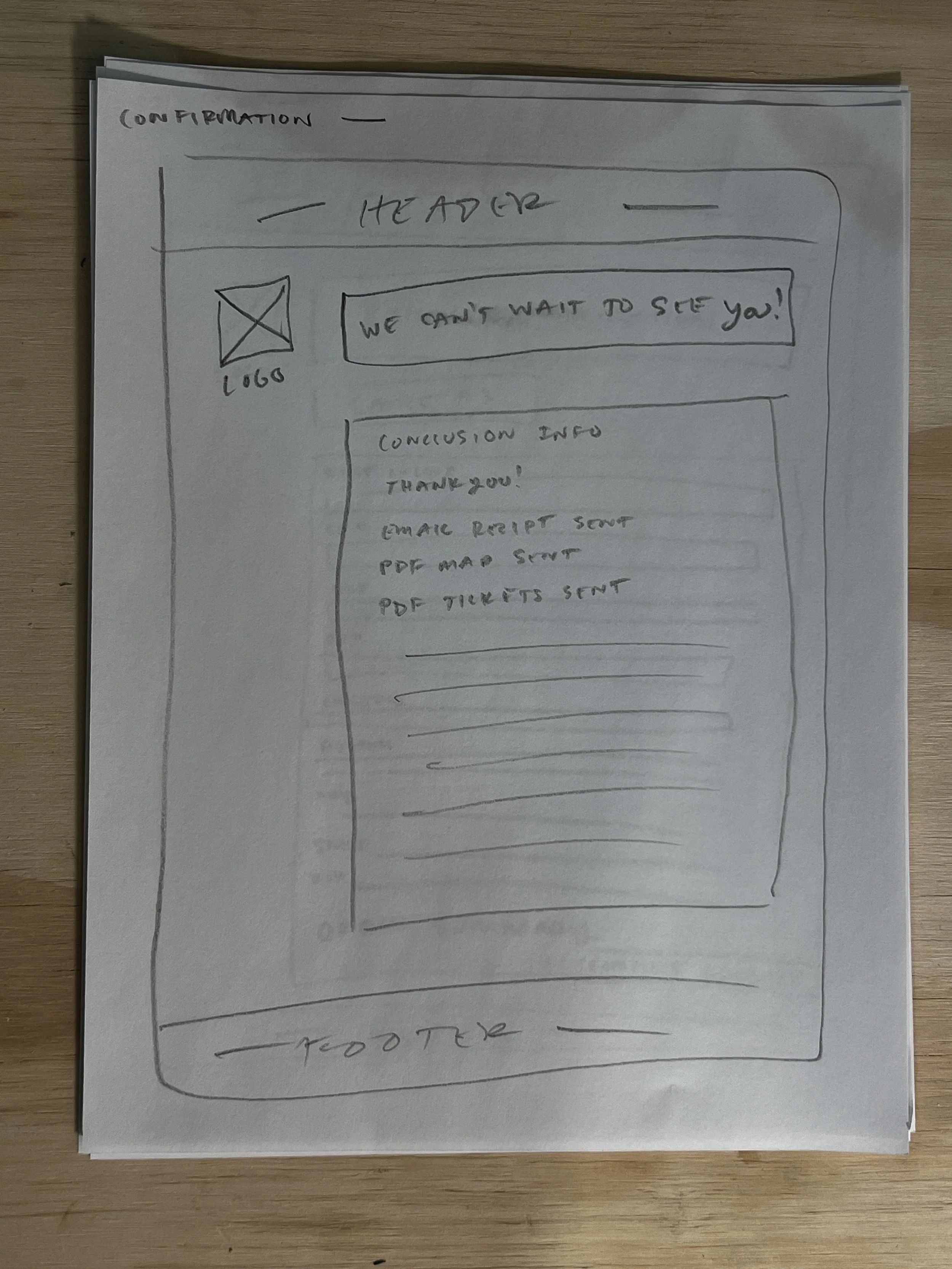
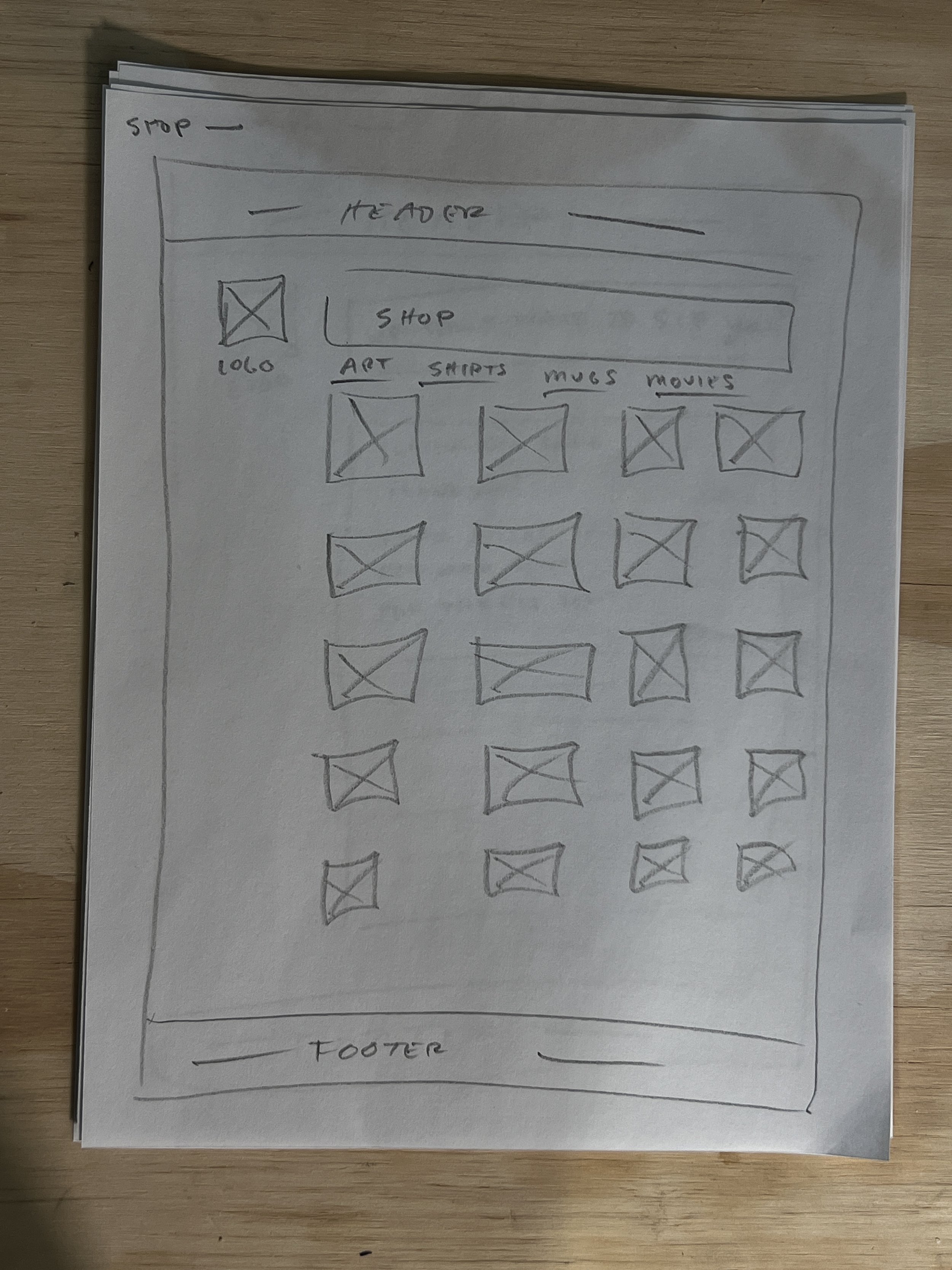
During the low fidelity design process I hand drew the pages in my proposed task flow to begin understanding how they would be laid out on a user screen. This process revealed that while I had removed numerous pages from the original CMZ design my proposed design needed additional streamlining. There were still too many steps between the homepage and the order confirmation page which decreased site efficiency for users. The hand drawn aesthetic of the font was designed to keep the fun and youthful nature of the website and zoo industry is a highlight of this design. See Phase 4 for the final layout design.
Mid-fidelity:
During the mid-fidelity design process I moved my sketches into Figma. This part of the design process allowed me to add additional details to my designs and get things ready to quickly iterate design aesthetics with text, color, and images during Phase 3: High-fidelity. During this process I reviewed feedback from Senior designers which enabled me to create a better product for our client. The feed back I received and adjusted is listed below.
- Use sentence case for site content, buttons, and links
- Design on the grid to aid in the site engineering process
- Design with multiples of 8px to aid in the site engineering process
- Remove boxes around content that makes the design feel tighter than need be
- Span content across 10 columns
- Combine Contact and Billing info pages
Design: Phase 3
High-fidelity V1:
After following the advise of Senior Designers on the team I moved onto High-fidelity where I was able to implement Art direction content, prototyping, and brand elements. Here I focused on the front page to help set the tone for the rest of the users experience. Following usability testing feedback I designed something simple and easy to use while still being lively and fun. On the front page I highlighted the Zoo’s Live Giraffe Camera and gave users an idea of the CMZ’s layout by including a low-tech hand drawn map. Green and tan were chosen for the primary branding colors at 60%Tan and 30%Green. Green is exiting, fresh, natural, and bold against the main tan color pallet. The original CMZ website prompted guests to, “Fall in love with our…Giraffes, Penguins, Elephants, and Otters” I kept the essence of that sentiment by including easter egg illustrations throughout the site design of those animals.
Usability Testing P2:
At the conclusion of High-fidelity V1 I conducted additional Usability Tests with 5 users, 3 of which were submitted for review. After the usability tests were completed I synthesized the data in order to weave it into my design adjustments.
HFV1 Pain Points:
- Combine Ticket + Date/Time selection pages.
- Combine Contact + Billing pages into one experience.
- Create preview of ticket selection before users submit their order.
Full Usability Testing synthesis below for HFV1 of the CMZ redesign.
Usability Testing Synthesis
4/15/25
All three participants noted design flaws in the Ticket Selection page. They felt the experience of purchasing tickets would be easier if the Ticket Selection page was paired with the Date+Time selection page. My plan is to combine those pages into one experience in order to increase user satisfaction and make the flow easier to navigate. Ticket selection will appear as the top most content followed by Date+Time selection information. This page will also include a small section of events. One user mentioned that it would be nice to have a preview of events on the ticket selection page in order to guide their date selection process.
It was also noted by every user that the contact and billing information could be moved to one page and the final page needs a preview of the purchase. They all felt having to navigate backwards to see their purchase was a design flaw. I plan to move forward with their design suggestions. I’ll combine the pages for contact and billing info which will remove two steps fromthe purchase process. The final page before the users submit their purchase will have a text box preview of what they had previously selected.
Additional changes around the continuity of the design will also be worked out. There are various issues with button and text input fields having similar designs that make things a bit confusing.
Design: Phase 4
High-fidelity V2:
For HFV2 of the CMZ website I adjusted the design to ensure it fit correctly on the grid and double checked that everything was divisible by 8px (+ or - 1px). I also incorporated the feedback from the usability tests and Senior Designers on the team. It was noted that the design of the buttons and text input fields could cause some confusion for users due to their color scheme being inconsistent with modern design principles. I primarily work in fine art and sculpture where those practices aren’t a concern, but I was happy to learn that consistency across websites is useful for users. I adjusted the buttons and text input fields so they follow contemporary design practices which I believe will increase usability of the website.
Project Wrap
Additional design changes:
With additional resources on this redesign I would dial in the branding. The green is working, but it could be more subtle. I’d also like to talk with Senior Designers about the overall feel. Websites today tend to stick to a thematic layout that renders most sites indistinguishable from other sites in their industry. I’m curious…where is my design lacking? What are its strengths? I’d also redesign the order completion page to feel more friendly and excited!
Takeways:
- Combine steps into one page when possible. Splitting information that is thematically similar on separate pages decreases usability.
- Simple can be visually compelling and easeful, but it can feel outdated. Striking a balance between simplicity and compelling is essential when making stylish contemporary sites.
- My personal site needs a redesign.
- When possible allow users to guide the design process and keep iterating with Senior Designers. Design, test, learn, design, and test!